


Colors play a major role in what we buy and use in our daily lives.
In a product, the first thing that grabs the attention of any potential buyer is its color. Further, colors also affect (and can enhance) brand recognition.
How is color so important to products and their design?
As foragers and hunter-gatherers, humans have had to survive tough and sometimes life-threatening conditions in the wild. These situations evolved our eyesight and color-recognition abilities, allowing us to detect threats or find nutrition, regardless of where we were.
To be simpler: More than 80% of what we perceive, know, and process about the world around us is through our eyes.
For an aspiring entrepreneur, it is highly crucial to understand colors and their effects on consumers to get a headway in the market.
Let’s unwrap all the nuanced hues of this topic.
What is color psychology?
A branch of psychology that studies and documents the influence of colors on human moods and behaviors, color psychology helps us understand how sight shapes our day-to-day decisions, and ultimately, our lives.
Our brain is constantly reacting to colors; we do not register it because it is a subconscious process.
As soon as our eyes perceive a color, the brain registers it and regulates our mood and emotions accordingly.
Research says that it takes around 90 seconds to make a subconscious judgement about a product, thing, or a person when we first experience it. What’s noteworthy, is that color contributes to that by at least 62%.
All of these point to just one conclusion — color matters, and it matters a lot more than we generally think.
Colors and their significance in products
Thanks to our instincts and shared cultural experiences, colors generally mean and represent the same thing to most people.
This means that they are used as symbols as well — the classic example being traffic lights. No confusion there as to what the green light means.
Let’s have a look at the individual colors and what they signify.
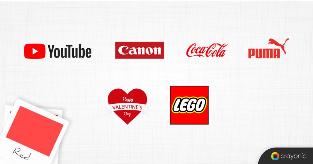
Red
The color of blood, red is generally related with passion and strong feelings/emotions. These include love, confidence, anger, and so on.
Red is also sometimes used to convey an agreement or a bond, as it is sometimes used for legal purposes.
Known as the ‘hot’ color, it also signifies violence and fire, and can be used to denote danger — stop signs, cautionary boards, etc.
If you want something to stand out or to be made importance, use red. Think red carpet events and celebritydom.
Products that use red:
- YouTube (liveliness, youth, individuality, expressions)
- Canon Inc (expressions)
- Coca Cola (liveliness, movement)
- Valentine’s Day (romance, love, passion)
- Puma (liveliness, movement)
- Lego (liveliness, expressions)
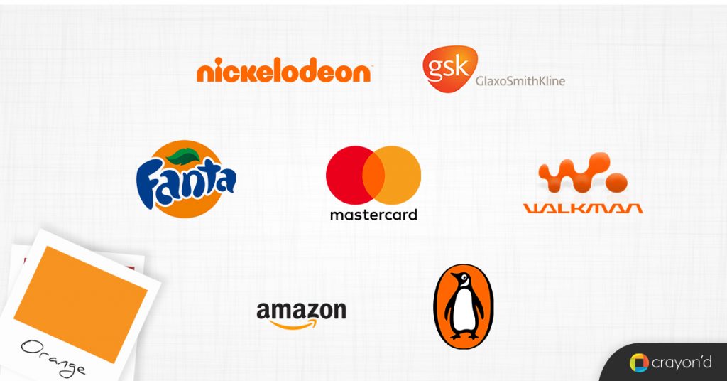
Orange
Symbolizing energy, orange is used to represent excitement, joy, vitality, and enthusiasm. In general, with its association with autumn and its approaching spring, orange is known for growth, evolution, and movement.
Its correlation with the fruit also makes it a symbol for health and wellbeing.
Orange is also a color used to represent ideas or concepts that are creative or out of the box.
- Fanta (liveliness, energy, joy)
- Nickelodeon (youth, joy, exuberance)
- Mastercard (growth)
- Amazon (growth, movement)
- GlaxoSmithKline (vitality)
- Penguin Publishing (growth)
- Walkman (liveliness, movement, vitality, exuberance)
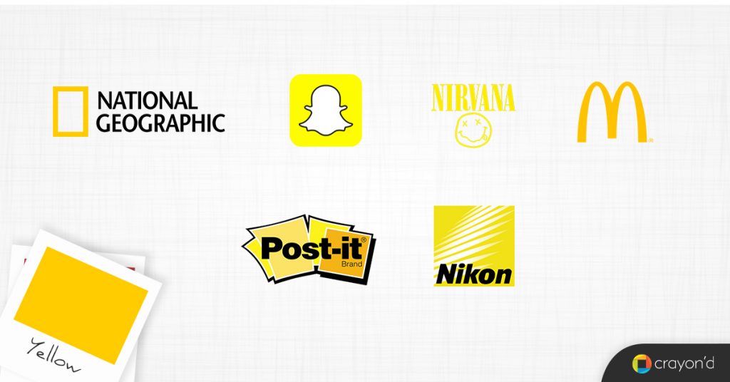
Yellow
Symbolizing happiness, yellow is one of the most visible colors. It is known to inspire and boost confidence, just like sunshine.
With its energizing effect, yellow brings in cheerfulness as well.
Paler shades of yellow are often associated with the opposite emotions of anxiety and fear as well.
- National Geographic (liveliness, truth)
- Snapchat (cheery)
- Nirvana (confidence)
- Post-it (inspiration, ideas)
- McDonald’s (liveliness)
- Nikon (visibility, ideas)
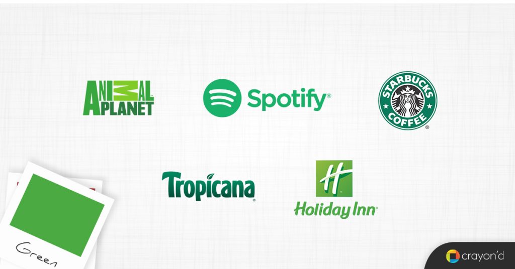
Green
The color of nature itself, green represents everything that is peaceful, normal, harmonious, and calm.
Quite down to earth, it is also used to bring in a sense of humbleness and relatability.
Green is also a sign for growth and new beginnings.
- Animal Planet (nature)
- Holiday Inn (recreation, serenity)
- Spotify (serenity, calmness, harmony)
- Tropicana (nature, nutrition)
- Starbucks (growth, relatability)
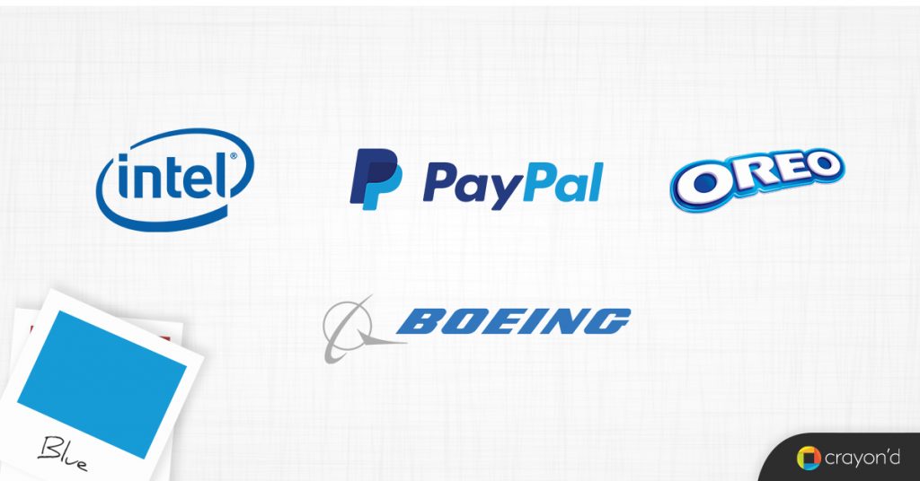
Blue
From the sky, blue is anything that is calming, and thought-provoking. It is also used to convey trustworthiness and used by banks and legal organizations.
Blue is also sometimes used to refer to a sad mental state, especially in the West.
Elsewhere, blue is known for its spiritual connotations.
- Intel (thought-provoking, innovation)
- Paypal (trustworthy)
- Oreo (energy)
- Boeing (aspirations, also, literally the sky)
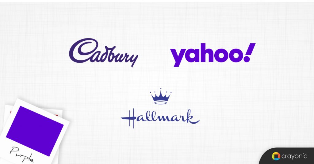
Purple
El Royale, purple is the color for anything luxurious. Historically associated with kings, it is also connotative of mystery.
Purple is also sometimes associated with imagination.
- Cadbury (richness)
- Yahoo! (creativity)
- Hallmark (imagination)
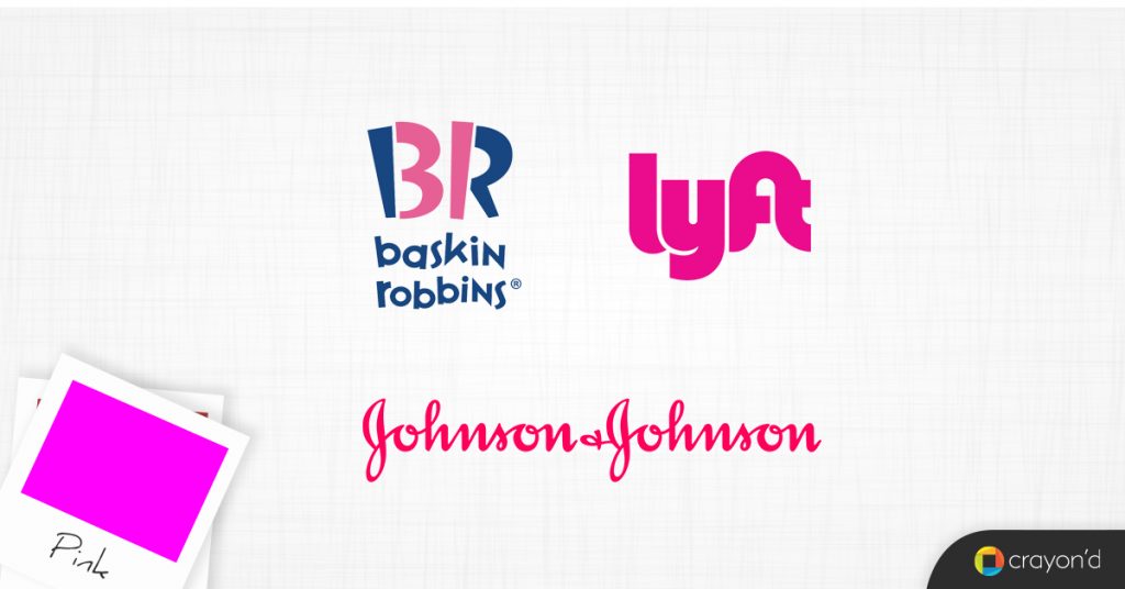
Pink
Culturally associated with femininity, pink is more than just for babies and girls. Pink denotes vitality, liveliness, hope, sensitivity, and romance.
- Baskin Robbins (liveliness)
- Johnson & Johnson (sensitivity)
- Lyft (movement)
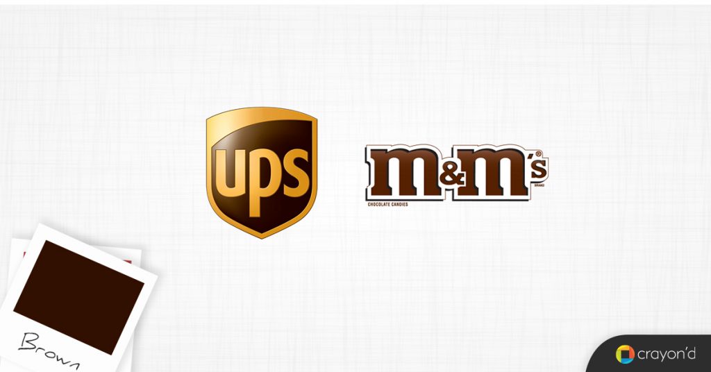
Brown
Dust, mud, and clay — brown is for anything that is about the earth, the terrain, or security (which is from its connotation of being rough and rugged).
Also used to represent reliability.
- UPS (reliability, movement)
- M&Ms (playfulness)
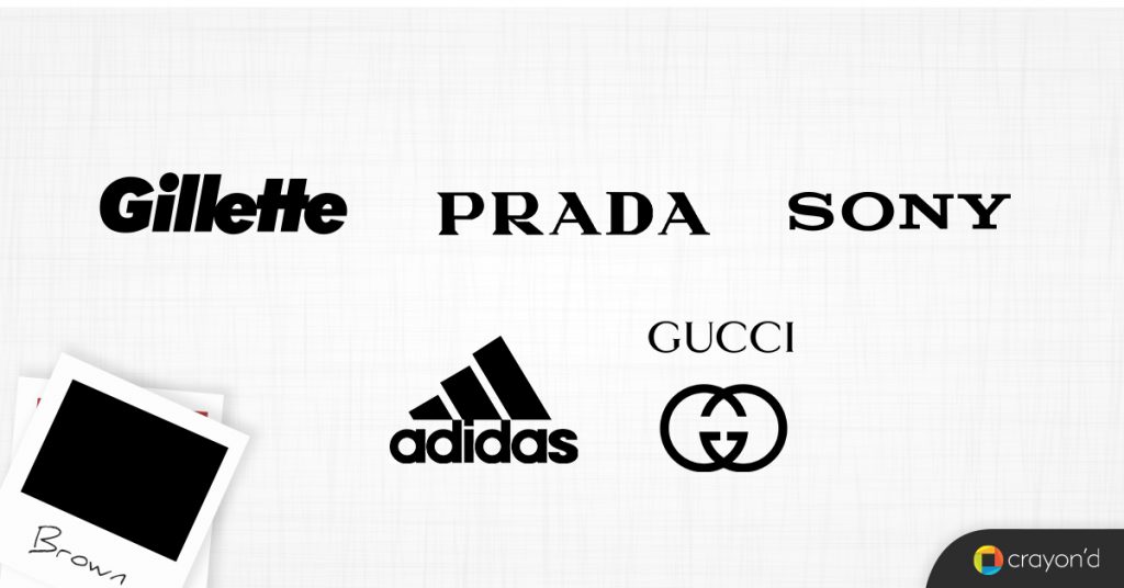
Black
Black is deadly. Black is serious. Black is for anything that is influential and plays a huge role in the background — think of formal brands and vogue products.
- Adidas (elegance, background)
- Prada (elegance, formality)
- Sony (neutral, capable)
- Gillette (capable, connotation with hair)
- Gucci (background)
Designers often use it in typography because of its neutral and formal nature.
White
White is purity. It is known to denote innocence, clarity, hope, and peace (doves).
It is also the symbol for new beginnings in the West (brides), healthcare, divinity, and also formality.
Designers use white to act as an anchor for other colors to pop out in their works.


Color Psychology in Branding
A picture is worth a thousand words, and the right color palette is more effective at making your brand’s identity different. Here is how it works:
Instant recognition
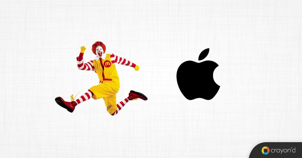
Let’s bring in a superstar in branding to understand this: McDonalds. With its two yellow arches and the red backdrop, it is one of the most recognizable brands in history.
It is a masterful creation — the arches convey the ‘M’ of McDonalds while the red helps with its association with meat, ketchup, and spices.
With this simple design being plastered all over billboards and advertisements, it becomes quite hard to forget.
Furthermore, with its fictional character of Ronald McDonald dressed in yellow and white as a prop/ambassador, the whole brand becomes memorable.
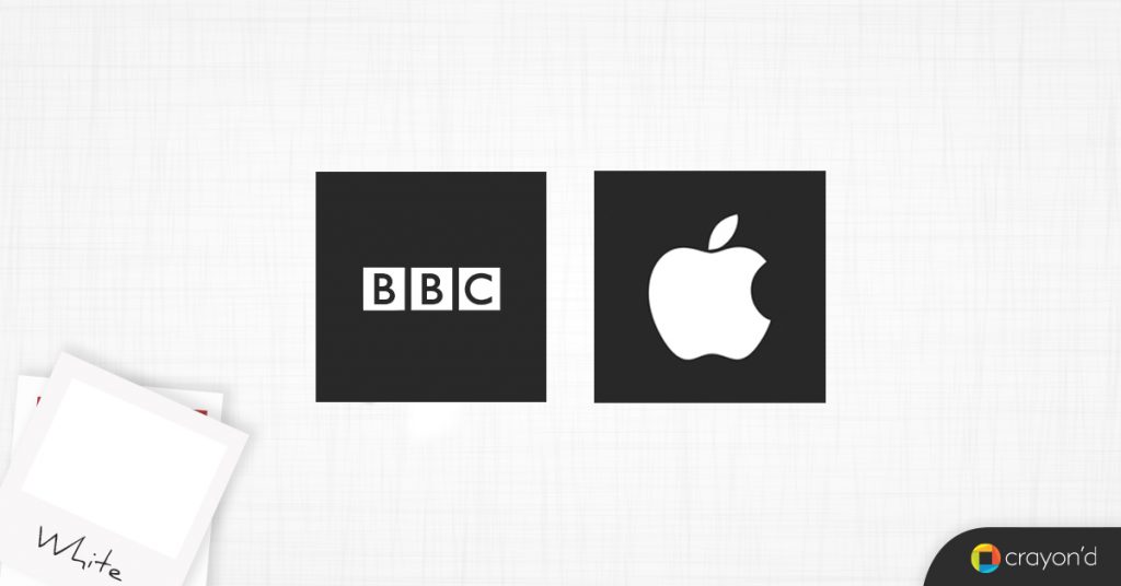
Consider a megabrand like Apple. They use color quite sparingly, with black to bring in a sense of formality while contrasting it with white and silver to convey clarity and refinement.
Anyone who wants a product that is simple yet powerful immediately thinks about Apple as a result.
Another player, Starbucks, relies on just the color green to make its black-bordered logo stand out in the midst of other cafes.
The logo itself is designed in a way to represent the spilling of milk onto a milky background. This association makes it quite memorable.
Twitter is a good example too. With a bird as an icon and blue as its primary color, it is perfectly recognizable as a platform for fast thinking, be it reporting news or going viral.
Purposefulness
FedEx does it quite simplistically — they use green for all of their ground-based services and orange for their high-speed, air-freight services.
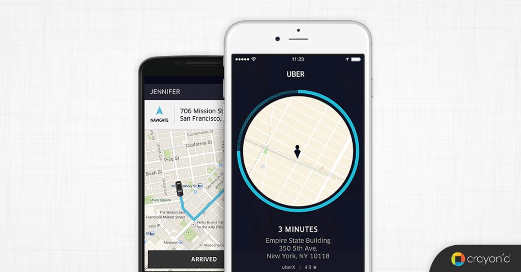
Uber and their plain black-and-white palette defines what they do best — serve you without any impositions or mental exertion.
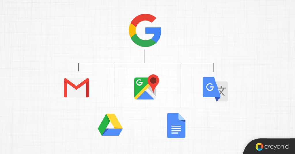
With its multi-color icon, Google makes its business model completely clear — it is here to be a part of every aspect of your life.
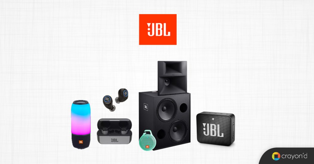
JBL, a player that makes audio products for consumers, conveys its innate liveliness with its complete orange brand identity.
All these examples are for you to understand that colors can be used to define and convey the purpose of a brand or a particular product.
Color Psychology in Product UX
When coordinated well, colors can elevate a design to greatness.
Every choice matters — products are made of microinteractions, such as hovers, clicks, and so on. The colors that you choose to represent those states decide whether the user gets comfortable with your UX or not.
For example, if a transparent icon does not become brighter when the user hovers on it, then they would feel like they are not able to interact with the product.
Similarly, when important icons such as sign up, start a meeting, and other calls to actions are not highlighted or appropriately colored, they can delay decisions and disappoint the customer.
Here are some other ways colors act as signals in a product’s UX:
Red
This is the color for every warning and crucial aspect. Close buttons, logout options, delete options, blocking features — all of these come in varying shades of red to show that your action has consequences.
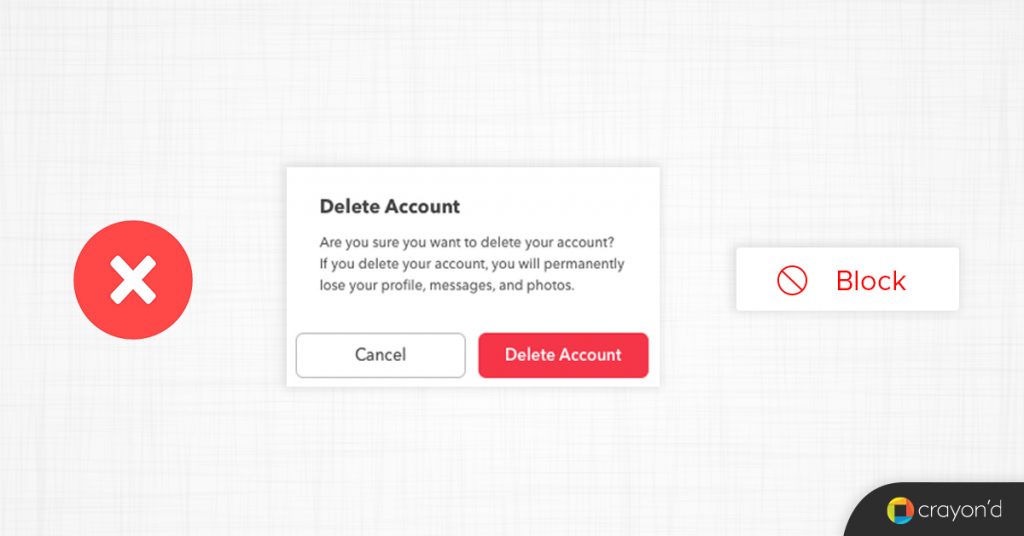
Error messages are also often red; the color’s urgency helps the user realize that a mistake has been made and needs to be rectified immediately.
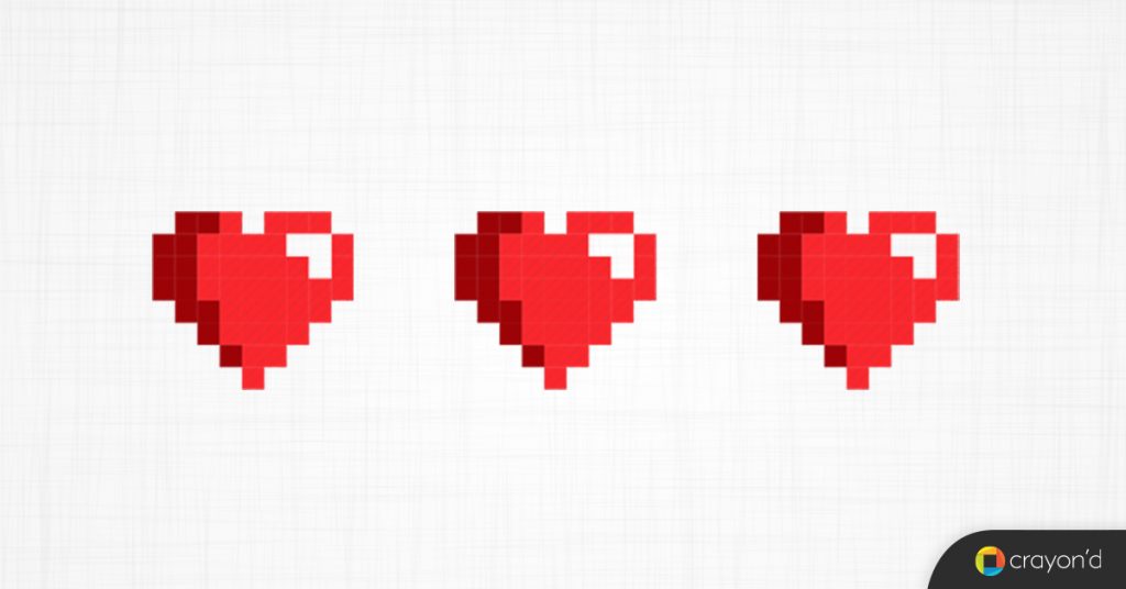
In games, red is often used to denote tokens of life and other important collectibles.
When used rightly within an interface, red will make the user act immediately.
Green
Ever-positive, green is the symbol for encouragement. In UX, green is used for progress bars, when processes are working as intended.

Green also is used for approval — when the user performs an action accurately, green is used to reassure and inform them.
Green is a primetime CTA color used to drive people’s attention. It is not as imposing as red, but its positive connotations forces users to click on the button.

Other actions within apps such as Create a page, create a note, create a workspace, finished (within a todo), send a message, and so on use green to show movement.

Blue
The poster boy for elegant user interfaces, blue is the most ubiquitous color in products, websites, and everything else.
Its calming and unimposing nature makes it the perfect color for every any requirement. Be it highlighting that something is a button or a link, or conveying activity states (switched on, ready to proceed, etc), blue is the go-to.

Modern UI is known for using colors with a purpose. Gone are the days when websites used to have a pink/yellow/purple background on every page.
Instead, white and black are used to build the UX, while blue acts as pillars. Take Medium for instance.
Black text, white background, and blue comes in when you select text or to show you that something is a link. Simple.
The same goes for Google Docs. Margin markers, buttons, pointers come in their shades of blue.

Blue is quite vital to product design — think about the previous versions of iMessage and the Email client.

Or the fact that Apple specifies blue in its Human Interface Guidelines as its systemcolor.

Not to forget that the majority of Windows 10’s elements are colored blue, and that Microsoft Word has always retained a splash of blue. Classy, indeed.
Final words
Colors have a huge influence on how consumers perceive your brand and product.
The actual ability of your product is sidestepped by its perceived ability, depending on how well the colors and design project your product’s purpose.
As an aspiring entrepreneur, you need to always know that users are always making judgements about your product, both consciously and subconsciously.
You can drive those to your favor by prudently choosing your color palette and carefully crafting your brand’s identity.
This blog obviously covers all the basics you would need to know to do so.
You can also approach a digital product agency like us who specialize in design thinking and can help you figure out the right tone and color palette for your business.
Go on and paint your dreams into reality!


Add comment