

Products without an online presence cannot sell themselves anymore.
Think about it: no matter what you want to buy, you would definitely have a look around on the web.
The same applies for your product as well as web experience.
Your customer base would constantly try to learn more about you before making the decision to purchase.
In this digital-first era, it is obvious that you would have to develop experiences for all devices.
But, what if there was a way to develop for all of them at the same time?
Building the same thing on a separate tech stack to enable one platform does not make any sense.
This is where Responsive Design comes in.
Come on in, and have a look at the best practices for 2022 that can enhance your digital presence.
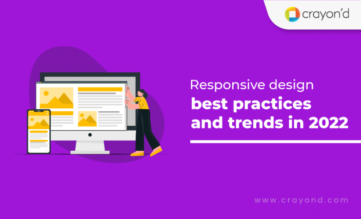
What is responsive design?
Responsive design is an approach to designing GUIs wherein they smoothly adjust to any screen size. Every element of the design, from fonts to pictures, resize or align themselves according to the orientation of the screen/device.
Most modern users switch between their computers and mobile devices pretty often, depending on where they are. Instead of developing two separate versions of the same thing, responsive design allows for one flexible entity.
Now, it is particularly being driven to greater use due to the sheer number of choices in the market. With responsive design, the website that you design for an iOS will look and work in the same manner on a Windows laptop as well.
Why should your product’s design be responsive?
With more than 58% of your potential customers on their smartphones, it is just a no-brainer to not have a website that is responsive.
A sub-par mobile experience will alienate them; moreover, it would not convince them enough to visit your product on a better computer.
Being modern and mobile-first is a necessity; not optional.
Responsive design is important —
- Responsive design increases reach to customers and clients on smaller devices (tablets & smartphones)
- Responsive design provides a consistent experience that can increase lead generation, sales and conversions
- Analytics, tracking, and reporting can all be in one place
- Time and cost on-site content management is decreased
- Staying ahead of the competition by offering higher standards
Responsive design also lends you a certain flexibility over other approaches.
With a product that follows the best practices, it becomes easier for you to make changes quickly and easily.
Instead of developing it twice — once for desktops and once for mobile — you can do it once and lean back.
Responsive design and SEO
Google prioritizes showing only the best performing websites and experiences on its first SERP.
By making everything responsive, you can boost your chances of landing higher on the rankings.
Obviously, the closer you are to the top, the better the chance potential customers will find you.
Responsive Design Framework
More than the actual aspects of drawing, visualization, and design, responsiveness is also reliant on the technology stacks that you choose.
There is a lot more to explore than the standard CSS and HTML baseline.
Material UI
This framework comes with a set of React components out of the box that are compatible with Google Material Design.
Android apps can also be built using this framework as they comply with Google Material Design. With its many layers and elaborate nature, it can be used for web projects that require extensive front-end functionality.
It also has a built-in CSS preprocessor that ensures the efficient use of various UI components.
Bootstrap
Bootstrap helps you build quality websites quickly and is one of the most reliable frameworks.
With perfect structural components with CSS grids, it allows you to build an easy navigation system for the web project, and so on.
Just a basic understanding of web technologies such as HTML, CSS, and JavaScript, and can create a highly responsive bootstrap website/web app in no time.
It offers you a number of themes and templates that can be customized to meet your industry needs and personal taste.
Because it is a mobile-first approach framework, the Bootstrap-designed websites/web apps are device-agnostic.
Cascade
A free and completely open-source CSS framework, Cascade lets you build semantic and non-semantic grid layouts.
With its universal approach, the designing is simpler.
Features include navigation elements, table designs, base templates, and more. Not only device-agnostic web UI, but you can also achieve designs that are cross-browser compatible.
Skeleton
Skeleton is relatively lightweight and small, and is fast and super responsive during the web development process. With a network of 960 bases, it makes for the perfect framework for designing web projects for desktops, tablets, mobile devices and other devices without affecting the quality of your web project.
It also has all the basic UI elements and a foundation design with form buttons, tabs, and a well-organized file structure.
In particular, the organized file structure helps significantly reduce overall website development time and produces better results.
Top 9 Design Best Practices for 2022
Keep your parallax scroll subtle
Using the parallax effect as an animation has been quite popular, but visual and UX designers these days are exploring subtler methods of employing it.
This is because parallax effects can be too distracting, taking away the attention from important information.
Using it for every transition does not make any sense either.
Having it for a vital part of your website, like a juncture within the narrative or right before a CTA makes more sense, as you can hook your audience using this effect.
Make the design have substance
Making things look good is a hard art to master.
Designing a stellar UX with the right icons would pay off only when the aesthetic has some weight or substance.
Think of it this way — if the pen that you hold is too light, can you use it to write?
If your icons seem too flat or too colorful, users might not find it alluring.
Or worse, they might not feel that the design elements are reliable.
Grainy textures is one way you can bring some substance to your website and its designs.

Dark Mode
One thing that has really swept the whole tech industry right now is the Dark Mode.
In the initial days of smartphones, screens were not really good at reproducing colors.
This necessitates using bright colors to guide the user around the phone.
But, the sensory overload that these many colors bring has become quite obvious now.
Dark Mode is the easiest answer to that.
It strips away all unnecessary glamour and keeps the colors only where they are needed, like buttons and etc.
Dark Mode also emulates the circadian rhythm, allowing people to not get too affected by the light from their screens.
We expect a lot more experimentation and varied implementation of this trend in 2022.
Consistent design patterns
A good design subconsciously hooks the user to a platform.
That is never possible if the design elements are inconsistent.
As humans, we crave stability. When users notice mismatch in the UX, or if they find that they have to constantly “look out” to use your product, they will not get comfortable.
This is where style guides come in quite handy.
Consistent font styling
This kills two birds with one stone.
Firstly, using a single font family means that the loading time of your website or product gets reduced.
Most browsers store such assets as cookies on the user’s end and that allows actual, new content to get loaded first.
Secondly, having a consistent font allows the user to recognize and relate with you.
Fonts are a key part to making an identity for yourself.
Where you cannot use the same font family, go for the same stylization, and the user would not detect the difference.
Makes for a smoother experience, doesn’t it?
Also, sloppy, inconsistent formatting will confuse your users and make them not return.
Short sentences
It is not news that attention spans have decreased.
But, more than anything, in this age of sheer choices, users do not have the patience.
They will only stay and use something that provides them value, and does so immediately.
Writing long paragraphs in appreciation of your website or product will not work out at all.
Think of your user as a car driver blazing on a highway.
Your billboard only has a few seconds to get registered in their line of vision.
This content optimization automatically translates into making your design more responsive.
Faster load times
Ensuring that the sections within your product and pages in your website load quickly is quite important.
This goes in line with the previous point about users having less patience.
Plus, slowness hampers the whole experience as the user needs to wait every time they take an action.
How can design help you here?
Well, if you overload the aesthetic with too many images or videos or other media, then that brings down the responsiveness of the website.
The lesser the density, the faster it loads and scales on every device.
Comfortable colors
Bright colors are not really comfortable to look at for a long time.
UX designers always have this one thing in mind — optimizing every element to ensure that the user feels at ease.
And muted colors can really make that happen.

Magic Theatre Studio’s website is a good example for this.
This is also why popular products have started to revamp their color schemes and stick to just a few shades and tints.
It creates a stronger brand association but not at the cost of overwhelming the user.
Accessibility modes
Accessibility should not be overlooked during design.
Plus, following a few key accessibility principles can improve the overall responsiveness of your website.
Legible fonts and high-contrast modes are encouraged to help users with eyesight problems. But, these also force you to simplify your design, thus making the whole thing more responsive.
The same principle applies for using soothing color combinations.
For people who have color-related autism or epilepsy, bright colors can overwhelm or completely throw them.
Going for a scheme that enables them would also make your website look more focused and responsive.
Adaptive design versus Responsive design
While responsive design focuses on creating a product experience that can retain its form on any screen and device, adaptive design takes it a step further.
Responsive design can limit your horizons, by forcing you to use images that do not break while loading.
With Adaptive design, your product loads assets only when they are interacted with.
This saves resources on your side as well the user’s end.
Adaptive works to detect the screen size and load the appropriate layout for it – generally you would design an adaptive site for six common screen widths:
- 320
- 480
- 760
- 960
- 1200
- 1600
Adaptive design can help you retrofit an existing experience for new devices.
Generally, you would begin by designing for a low-resolution viewport and work your way up to ensure that the design doesn’t become constrained by the content.
Ultimately, a singular approach of either this or that would limit or overwhelm you.
That is why we bring you the following design trends that blur the line between being merely responsive and truly adaptive.
6 new design trends on the horizon in 2022
Retro fonts
Everything in our culture and experience happens cyclically.
Old fonts were phased out because they were too regular and uncool.
But some versions of those have started resurfacing.
Some good examples include the page for Spotify’s Carnival promotion — the stylization calls for attention without being too loud.

Neumorphism
Until Apple killed it with its new minimal and white aesthetic in 2013 using iOS 7, skeumorphism was all you could see everywhere.
Skeumorphism is essentially designing an interface to look like its analog/IRL counterpart.
E.g., Earlier UIs of Apple’s music app tried to mimic the design of their original iPod.
That is gone, and for the best of reasons.
But what replaced it was a shallow 2D kind of representation that does not let the user know if they can perform a gesture or not.
Hence, neumorphism.
From bringing depths to buttons to slightly highlighting a corner to show you that you can scroll, c is fun and intuitive.

3D Visuals
With hi-res screens everywhere, leveraging 3D has to be the newest avenue out there.
Not only do they look good, but they allow you to add more depth and clarity to your designs.
More information in less space.
More visual engagement using the same design.
There is also another aspect to that — it just feels more natural than any 2D depiction that we generally see everywhere.
Since 3D is not the norm yet, utilizing it can be your chance to stand out.
Here is a fine example of how 3D visuals can make the simplest illustrations pop.
Horizontal scrolling
For long, scrolling has always been done in one direction: vertical.
But the up-to-down movement is slowly becoming boring.
With the advent of media like stories and carousel posts, horizontal scrolling is just part of our internet habits as well.
You could make some parts of your website behave like that.
It works as a great storytelling tool and encourages focus among your users.
Gaussian blur
This is when a color is blurred to spread the whole tint out, creating a virtual atmosphere.

This also allows you to use multiple shades/colors without looking tacky.
Scrollytelling
The natural evolution of the slideshow, scrollytelling happens when a certain part of your website or product presents new information while the user scrolls.
Scrolling is one of the most natural gestures when we browse the web, so much so that we do not even realize it when we do it.
Letting a story unfold while scrolling also gives the user a sharp sense of control over the experience, something that slideshows and videos are incapable of.
The user can go up and down the narrative at any point, and they can easily understand the progression.
Especially if the animations or images change along with the scrolling.
Responsive design Examples
Designmodo
With their clear design, they are a baseline example of how responsiveness looks like.

Regardless of whichever platform you view their website on, nothing seems off.
Crayon’d
It might seem like a brag to mention our own digital experience here.
But, our passionate developers have quite the knack to create responsive designs that work, no matter which platform you visit us on.
Every inch and frame scrolls smoothly, and there is nothing that pops out too much.
Twitter
Almost every social media giant out there has moved to a responsive framework.
Out of them, Twitter was one of the leading pioneers.
The ‘Compose Tweet’ button pops up elegantly no matter which device you are on.
And the rest of the interface is well-aligned so that your focus is on the feed at all times.
The Boston Globe
An excellent example of minimal, responsive design.
With just three columns on the desktop view, the overall design compresses into a single column on a phone.
The rest of the content fits itself and adjusts accordingly to your device.

Bottomline
As years pass, the line between the UX of smartphones and other computing devices blur more and more.
This is good news — it means that you can have a stronger and much more consistent brand presence than ever before.
This also means that you would have to employ the best technology out there.
As an aspiring entrepreneur, if all of these seem to puzzle you, well then, you are in luck.
Digital product agencies are always up for building experiences and products from scratch, or polishing existing ones.
Their expertise with modern technology and human-centered design would deliver you something much more than merely responsive.
So, what are you waiting for?


Add comment